

Unlock the Editor’s Digest for free
Roula Khalaf, Editor of the FT, selects her favourite stories in this weekly newsletter.
If there were ever a time to abandon your heritage and go ostentatiously “woke” with your corporate branding it was almost certainly not November 2024, the month Donald Trump was re-elected to the White House amid a widespread backlash against the excesses of progressive identity politics and culture.
Yet that was precisely when Jaguar, the century-old luxury British carmaker whose image until then was largely one of tradition and conservatism, saw fit to release an instantly notorious 30-second advert that appeared to do just that. The ad featured a group of androgynous and ethnically diverse models of varying body shapes and ages, against a rocky, Mars-like pink background but, puzzlingly, no automobiles. “Do you sell cars?” asked a certain fellow electric-car maker in response to it, on his social media platform, X.
It was not only the advert itself that seemed out of step with the cultural zeitgeist though — it was the whole rebrand. Jaguar, previously written in capital letters, was now “jaGuar”, with only the G capitalised, in a modernist sans-serif font whose lower and upper case letters are all the same size. The famous leaping Jaguar — I try not to throw around the word “iconic” too much but it probably applies here — was no longer visible next to the brand name. In a press release, the company talked of a “bold” new ethos inspired by its new slogan, “Copy Nothing”, in honour of its founder Sir William Lyons. The problem was that it seemed, in fact, to copy everything. Jaguar’s loud roar had become a generic, virtue-signalling, playing-it-safe whimper.
And Jaguar’s — sorry, jaGuar’s — rebrand came at a time when other, better advised companies had been going in the other direction. Over the last couple of years, a number of them have eschewed the bland, blend-in-with-everyone-else branding that has dominated for the past 15 years or so and started to return to a design that harks back to their heritage and tradition.
For instance, Saint Laurent — which in 2012 had switched to a sans-serif, Helvetica-adjacent typeface — has quietly returned to a more distinctive serif font that looks awfully similar to its previous one, albeit without the “Yves” at the start. Burberry has also dropped the very similar and characterless font it had rebranded to in 2018 and gone for a more traditional serif typeface, along with a new “archive-inspired” version of its Equestrian Knight logo.
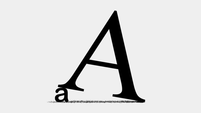
Meanwhile the kind of humble, we-don’t-want-your-money, all-lower-case, primary-colour logos made popular by Silicon Valley start-ups like ebay and airbnb are being phased out, to be replaced by title case or even all-upper-case logos. The latter taps into a new more macho cultural energy: several studies have shown that brands that use all lower-case logos are associated with feminine characteristics, and vice versa for the all-upper-case ones.
After 14 years of drinking “pepsi”, with a globe logo that warped the traditional red-white-and-blue horizontal colours, we are now drinking PEPSI again, with a return to the symmetrically colour-distributed globe and brand name in the middle as it was in the 1990s.
“We designed the new visual identity to connect future generations with our brand’s heritage,” said PepsiCo chief design officer Mauro Porcini. “We want to instigate moments of unapologetic enjoyment”.
“Unapologetic” captures the new cultural moment nicely. Pepsi launched its lower-case-logo during the financial crisis in 2008, at a time when greedy banks made Silicon Valley’s start-ups look soft and cuddly in comparison. As a deep global recession set in, fashion runways were taken over by minimalism, practicality and discretion. The era of “quiet luxury” had begun.
No longer. I have written before about what the trend forecaster Sean Monahan describes as the new “boom boom aesthetic”, characterised by maximalism, conspicuous consumption, opulence, and a more individualistic culture. The new formality and conservatism in branding is part of this broader shift towards a louder, brasher era. British Vogue declared quiet luxury dead last December.
And anyway, these days it’s not the financial sector we fear the most: global trust in the banking sector is up 15 points since 2015, according to the 2025 Edelman Trust Barometer. Trust in technology companies, meanwhile, is down ten points in the last decade among Americans, according to Edelman, while two-thirds of Britons are “nervous” about the rise of AI, according to Ipsos Mori.
When you have fears of an existential threat to humankind to contend with, a bolder, less clinical pre-internet aesthetic feels quite comforting.
jemima.kelly@ft.com
Read the full article here